Chocolate’s Wild Side — #4 is #1 Hey!


Thanks everyone for your feedback on the logo design for the Landmark Wild Chocolate Reserve. We got responses all around the globe, from Peru to Germany.

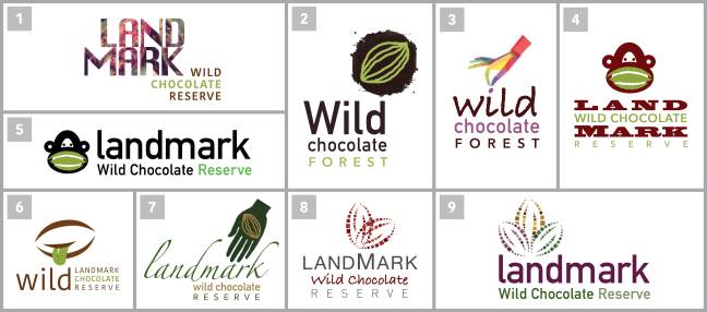
The clear winner was #4, way ahead of the rest by more than double. #1 was second, # 5 was third, #2 was fourth and #3 was last in place (though I did get responses that the monkey was very cute and had fans).

For the record #2 was not one of our designs but the current logo being used by LWCR on their website.

Our next step is to revise and improve the direction chosen and also create a horizontal version.

All logos need to be designed both vertically and horizontally to accommodate different space constraints.

Go to my FB page to comment.

LWCR finds, preserves and exports the wildest chocolate on earth — harvesting pockets of wild beans with exceptional chocolate flavor from the Amazon rain forest — where cacao originated. Sustainable harvesting saves this exceptional cacao from extinction and before it disappears.

Read the Washington Post article about Mark Christian and the project.

Chocolate’s Wild Side

Landmark Logo Blog LI New Format.jpg

I’m so excited to be working with Mark Christian on the logo for his new chocolate venture, the Landmark Wild Chocolate Reserve. This his organization finds, preserves and exports the wildest chocolate on earth — harvesting pockets of wild beans with exceptional chocolate flavor from the Amazon rain forest — where cacao originated. Sustainable harvesting saves this exceptional cacao from extinction and before it disappears.

The first two chocolates are from the Beni River Valley in northern Bolivia and the Purus River Valley in northwestern Brazil.

Our initial brainstorming led us to our target base: gourmands and connoisseurs, the 5% of the chocolate loving public who want the rare and unattainable — adventurers who believe in sustainable economics, Harley rider wannabes.

We are in the creative process now and would love your feedback on some of the concepts for the brand we’ve developed. Let us know your faves.

Go to my FB page to comment. @sharonkleinGD

Read the Washington Post article about Mark and the project.

Sharon Klein Graphic Design, LLC | Portfolio | 212.645.8163 | FB

What‘s an Heirloom Chocolate?

… and how do you brand it?

In simple terms it’s the highest quality, most flavorful cacao sourced from around the world that chocolate can be made from.

HCP Logo Blog


Our design journey began by creating a fair number of versions with the direction to incorporate a monkey image because most of the cacao comes from the Central and South American rain forest regions — plus they’re cute.

After further discussions with the organization they determined it was paramount to incorporate into the icon the people involved in the cacao process —the farmer as well as the person who buys this special chocolate. The equal importance of the cacao pods on the tree was accomplished by making them oversized and multi-colored as they grow in nature.

The larger design is the final inspirational icon and logo created for the non-profit Heirloom Cacao Preservation Fund (HCP), a 501(c)(3) organization that works closely with the Fine Chocolate Industry Association. It will be used in many forms but mostly to promote on chocolate packaging.

The HCP collaborates with the USDA and together with chocolate industry professionals, chocolate makers, farmers, and chocolate enthusiasts are determined to save the quickly diminishing Theobroma cacao trees that produce the most flavorful chocolate and certify the farmers who grow them and help them receive higher, more consistent prices.

An alternate version of the logo in vertical format within a shield shape, will be placed on all packaging utilizing Heirloom beans designated by the HCP.

We also are consulting with them on their event materials, on-line newsletter and website — see more here.

Re-Covered

AHRC Nassau, in partnership with family members, is committed to enriching the lives of people with intellectual and other developmental disabilities.

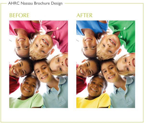
SKGD took a new spin on how the child is represented on their Lindner Center brochure cover with a fresh, focused and engaging look, incorporating vibrant colors and a sense of joy.

AHRC Brochure

The interior layout has been redesigned as well — the flow of the brochure, how it opens, unfolds, is intentional — and leads the reader through the story.

Behind the scenes we also retouched some of the T-shirts from the original image as they did not convey the strong primary color balance we wanted to achieve.

AHRC Nassau Brochure Design